
Bentley Motors has unveiled a major redesign of its iconic Winged B emblem, calling it the “biggest change” in the luxury brand’s 105-year history. The updated logo, developed by Bentley’s in-house design team under the direction of Robin Page, reflects a bold shift in the marque’s visual identity ahead of the launch of its new concept car next week.
This marks only the fifth time Bentley has rebranded its logo since its founding in 1919. The redesigned emblem is based on an original concept by interior designer Young Nam, and is intended to usher in a “new era of Bentley design language,” according to the company.
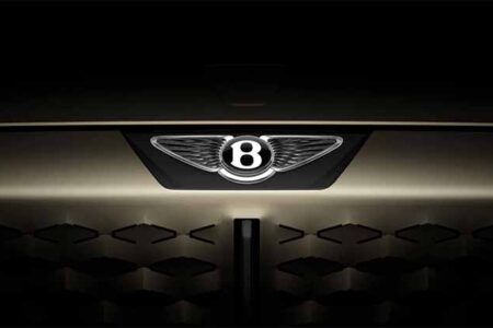
Minimalism Meets Power: A Reimagined Winged B
While the central ‘B’ remains intact, Bentley’s design team has significantly simplified the surrounding wings. The feathers have been removed from beneath the emblem for the first time in the brand’s history. The new wings now feature a sharper, diamond-like pattern, inspired by the angled silhouette of a Peregrine Falcon in flight—a nod to speed, precision, and aerodynamic elegance.
In a further evolution, the emblem has been restructured so the ‘B’ appears encircled by a chamfered metal ring with a bevelled glass edge, making it visually adaptable for digital and physical applications without the wings.
Alongside the main emblem, Bentley also introduced a flat, line-drawn version of the logo, signalling how the new design will be deployed across different platforms and mediums.
A Signature for the Future
“If a luxury brand is the product of the stories it has created, then its emblem is its signature,” said Robin Page, Director of Design at Bentley. “In an era of ever-increasing digital complexity, simplification is not just a trend but a necessity. The new emblem is cleaner, sharper, and more impactful than its predecessor.”
Page emphasised that both the new logo and upcoming concept car represent the brand’s transition into a more progressive and design-forward future, while continuing Bentley’s tradition of handcrafted excellence.
Part of a Larger Trend in Automotive Branding
Bentley joins a growing list of luxury automakers refreshing their visual identities for the digital age. Audi recently introduced a flat version of its iconic four rings, and Aston Martin enlisted Peter Saville for a “subtle but necessary” update to its own winged logo. Jaguar, too, rebranded last year with a radical new identity—though not without polarising reactions.
With its new emblem, Bentley aims to honour its storied heritage while aligning with modern luxury aesthetics and digital fluidity, reinforcing its role as a leader in craftsmanship and innovation.